A recent science fair project by 14 year old Suvir Mirchandani (right), made headline news for identifying possible wasteful government practices. In his study, Suvir et al. demonstrated a switch to Garamond font led to a reduction of ink utilization in several federal documents. He then extrapolated these findings across all government printing to estimate a potential yearly savings of greater than $400 million dollars. The implications being so great, Suvir's work was featured in the LA Times, Huffington Post, Forbes among others and even an interview on CNN. However, an important aspect to the scientific process is whether the work is reproducible, especially by other research groups. In this experiment, Scientific AmeriKen will attempt to duplicate the findings that the font Garamond saves greater amounts of ink.
On the basis of Suvir's published data we hypothesize the use of Garamond font in our hands will yield less ink utilization than other fonts and we also hypothesize lower paper utilization.
Methods are outlined well within Suvir's paper, however, Scientific AmeriKen lacks a program able to change fonts within PDF files. The methodology of this experiment will be different but comparable. To calculate ink utilization Scientific AmeriKen utilized APVSoft APFill Ink Coverage Software (ver 5.8), although all settings were not described in Suvir et al., an attempt was made to identify resolution settings in the table on right using pages 96-100 from the 2014 Budget Report. As a match could not be made Scientific AmeriKen continued with 300 DPI and "Letter" page size for all calculations. Determination of pages of paper used was done by creating 100 pages of latin text within Microsoft Word 2003 (on Windows XP platform), using Times New Roman Font at size 12 pt. All pages were then converted into other fonts and page count was then recorded. One page of 12 pt Times New Roman latin text and conversions of this text to Garamond and Century Gothic were used to create Adobe PDFs that were then used for ink calculations. Square inches of ink calculated by multiplying the percentage of ink utilized by 8.5 by 11, assuming a letter sized piece of paper.
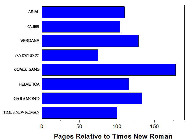
Garamond requires significantly greater amounts of paper.
To explore paper utilization, 100 pages of Latin text was created using 12 pt Times New Roman Font and then changed to other fonts to identify differences in total page count (Figure A). Our data indicate that relative to Times New Roman only Freestyle script utilizes less paper. Garamond required 133.5 pages relative to 100 pages of Times New Roman and was only smaller compared to Comic Sans font. These findings suggest Times New Roman may serve as the best font for both readability and paper conservation.
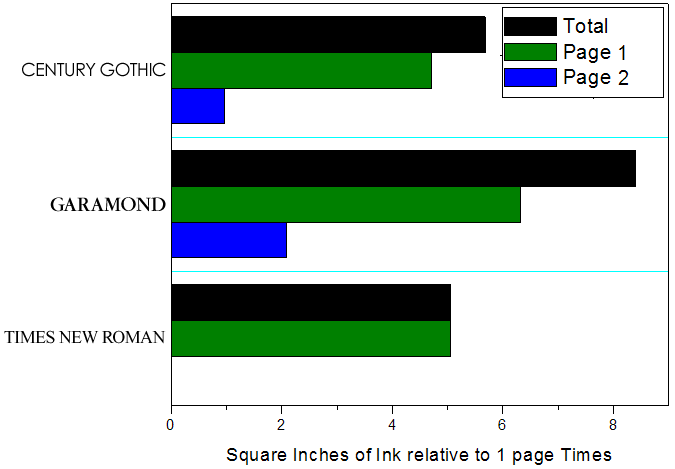
Garamond requires greater ink utilization than Times New Roman and Century Gothic
To compare ink utilization, Scientific AmeriKen compared area of ink coverage in PDF files that contained one page of 12 point Times New Roman "latin text" or the equivalent number of pages when converted to Garamond or Century Gothic (Figure B). Our findings reveal Garamond font required significantly more ink to convey the same amount of information. Surprisingly Century Gothic was nearly comparable to Times New Roman, requiring only slightly more ink to provide that extra stylishness.
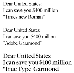
Font discrepancy may account for differences between studies
While attempting to perform several aspects of this study in Adobe Photoshop, we found that multiple versions of Garamond exist. To better understand if one of these variants may be responsible for the observed differences, Scientific AmeriKen set out to recreate the graphic seen in Suvir's CNN interview (Figure C). It is clear from this recreation that Suvir likely utilized "Adobe Garamond" in his analysis as this version appears lighter and smaller than Times New Roman in a manner similar to what is seen in the CNN interview. Whether "True Type Garamond" is the font that is used in Microsoft word is unknown, however, the characteristics are similar and likely represent a similar wastefulness in ink and paper.
Often the press moves faster than the speed of science, the unfortunate result being the dispersal of misinformation that leads to confusion, wasteful practices and mistrust in science. Here Scientific AmeriKen demonstrates the faithful application of findings from Suvir et al. could lead to greater and wasteful paper and ink utilization. However, the scientific process moves forward due to the larger implications of Suvir's work. Although Garamond comes in many variations, his discovery that an optimal font could save the government millions still stands as a viable possibility and is worthy of further investigation into new fonts that utilize less ink and space, yet still maintain the readability of tried and true Times New Roman.FIGURE A
FIGURE B
FIGURE C
Although some may not agree with taking such critical analysis on the work of a junior high school student, Scientific AmeriKen believes science is blind to age and the mission to unveil true knowledge is paramount. Suvir certainly has a bright future as a scientist and if anything this work by Scientific AmeriKen stands not as a refutation of Suvir's work, but as a wake up call to mainstream news to improve their fact checking skills. Until then, a skeptical eye will always be open to the latest and greatest that comes out of the science section.
Discuss this work at ScienceChatForum.com